


Data Scientists, Data Analysts and Data engineers must study, analyze and process large data sets daily. So to make their work more accessible, it's important to have the best data visualization tools available at their disposal.
Data visualization tools are not meant just for data scientists. In fact, tech teams of developers, data analysts, managers and designers also use data visualization tools to get data-driven insights from large data sets.
According to Fortune business Insights, this increased adaption of data visualization tools in non-data native roles (like managers & executives) would cause the data visualization market to hit $19.20 billion by 2027.
The data visualization market is growing at a compound annual growth rate of 10.2%. And if you are not joining in, you are missing out.
What is Data Visualization?
Data visualization is a graphical representation of data in the form of graphs, charts, and tables. Data visualization tools provide an easy and accessible way to study and understand trends, patterns, and outliers in data.
What Are Data Visualization Tools?
Data visualization tools are software that renders information in a visual format such as a chart, graph, or heat map for data analysis.
The best data visualization tools help people absorb general data and make the process faster.
11 Best Data Visualization Tools
There might be dozens, in not hundreds, of tools, apps, platforms and scripts to choose from. But, not every tool makes its way to the best data visualization tools list.
So, to help narrow down your search, we reviewed some of the popular names and a few new contenders in the data visualization space. Then, we evaluated these data visualization platforms for their performance, use cases, integration capabilities and pricing to compile this list of the ten best data visualization tools.
1. Tableau Public
Tableau is one of the most popular data visualization platforms, and it comes with a wide range of versions, including a desktop app, an online version, and a free public option. Here we will be talking about the public version.
The public version of Tableau is a free data visualization tool that can be used in multiple ways. Journalists, data junkies, or those who want to quantify the data of their own lives use Tableau Public. They also offer an extensive gallery of infographics and visualizations that can be used as inspiration by other users who are interested in creating their own.
Pros:
- Excellent data visualization capabilities
- Easy to use
- Mobile friendly
- Community & priority customer support
Cons:
- Your data is visible to others in the public version.
- Non-free versions are a bit on the higher side.
- You can not process large & complex data sets in the public version; for that, you need to go with the Tableau desktop version.
Data Visualization Example: Tableau Public
We accessed the public gallery of Tableau public to prepare a sample data visualization report representing average call time, call abundant time and other important KPIs:
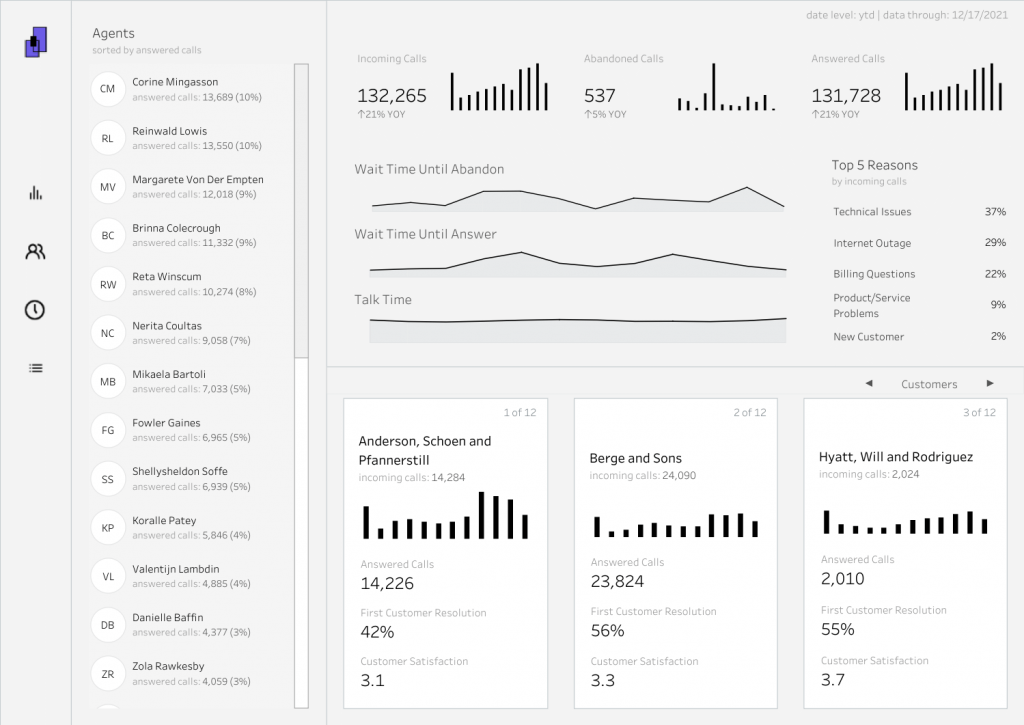
Editorial Note:
- Tableau is a powerful BI tool that has multiple versions for multiple applications. Tableau Desktop & Tableau Public are two versions extensively used for data visualization. Tableau Public has 8.2 ratings for ease of use and 8.3 for quality support and implementation by G2.
2. Qlik Sense
One of the major players in the data visualization market, Qlik Sense has established its presence by enabling accelerated & customized visualizations. Qlik Sense is also popular in enterprises because of its features like analytics, enterprise reporting, user-friendly interface and Business Intelligence capabilities.
Qlik has its unique "drag and drops" visualization interface that allows users to easily add data from multiple sources like a database, a data warehouse or even a spreadsheet. All without writing a single line of code. This unique 'drag and drop' feature distinguishes this data visualization tool from others.
Pros:
- User-friendly interface
- Capable of handling large data sets
- Fewer data processing time
- Less maintenance
- Cost-efficient
Cons:
- Poor Customer Support
- Being a system-dependent tool, it faces RAM limitation issues
QlikView Demo:
Check out this Qlik Sense Demo
3. FusionCharts: JavaScript-based Data Visualization Software
FusionCharts is a JavaScript-based data visualization software that's used for creating complex mobile and web dashboards with ease. It houses over 150 different types of charts and over 1000 maps. It can also integrate with JS frameworks (like React, Angular, jQuery, and Ember) and server-side programming languages (like PHP and Django).
FusionCharts provides the ready-to-use codes for its graphs and maps so that they can be easily embedded on a website or a mobile application. However, since it's mainly built for creating dashboards rather than straightforward data visualization, this tool is a bit more expensive than any other tool on this list.
Pros:
- Ready to use codes to add dashboards
- Active community
- Good customer support
- Made for one specific reason
Cons:
- Expensive (costs $500 for one developer license)
- Complex set-up
- Poor user-interface
Data virtualization example: FusionCharts
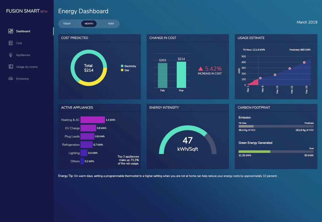
Editorial Note:
- If you are someone who needs to add custom dashboards on third-party websites or your website, then FusionCharts is worth the investment. If you are looking specifically for data visualization, we recommend checking other solutions on this list.
4. Infogram
Infogram is a second tool in our data visualization tools comparison list that comes with drag-and-drop capabilities. This feature makes this tool a popular option among non-designers who use it for creating marketing reports, infographics, maps, dashboards, and more.
Once you have finished visualization in this tool, you can export it in multiple formats like PNG, JPG and GIF, which makes it easier to add the final visualization to websites and marketing reports.
Pros:
- Includes a free plan with basic features
- Huge library of charts and maps
- Easy to use
- Drag & Drop functionality
Cons:
- If you want to create a very complex visualization, Infogram isn't for you.
- You need Internet access to use it.
5. Whatgraph
Used by marketing agencies and in-house marketers, Whatagraph is one of the most popular data visualization tools. This year, Whatagraph also launched a data transfer feature, allowing you to move data from marketing sources to BigQuery and then visualize it in this tool.
Pros:
- 40+ data sources, including platforms like Google Ads, Facebook Ads, Snapchat Ads, and many others
- 100+ report and dashboard templates
- Advanced data visualization and report customization
- White label feature for agencies
Cons:
- Only annual pricing is available, which effectively means a $2,000+ investment to get started with the cheapest plan
6. Datawraper
Datawraper is one of its kind data visualization platforms. It's developed by a team of designers, developers and journalists for designers, developers and journalists. This tool is extensively used by Journalists and software developers who need to display complex information in an easy-to-read format.
Using Datwraper, you can present your data in the form of 19 different chart types, three map types, and tables. In addition, Datawraper is the only tool that lets you create charts and maps without signing up on their platform.
Pros:
- You don't need to sign up for the platform to use it.
- Supports multiple-language
Cons:
- You can not share your dashboard with others without signing up for the platform.
- Expensive tool because the custom plan costs €499 per month
Example:
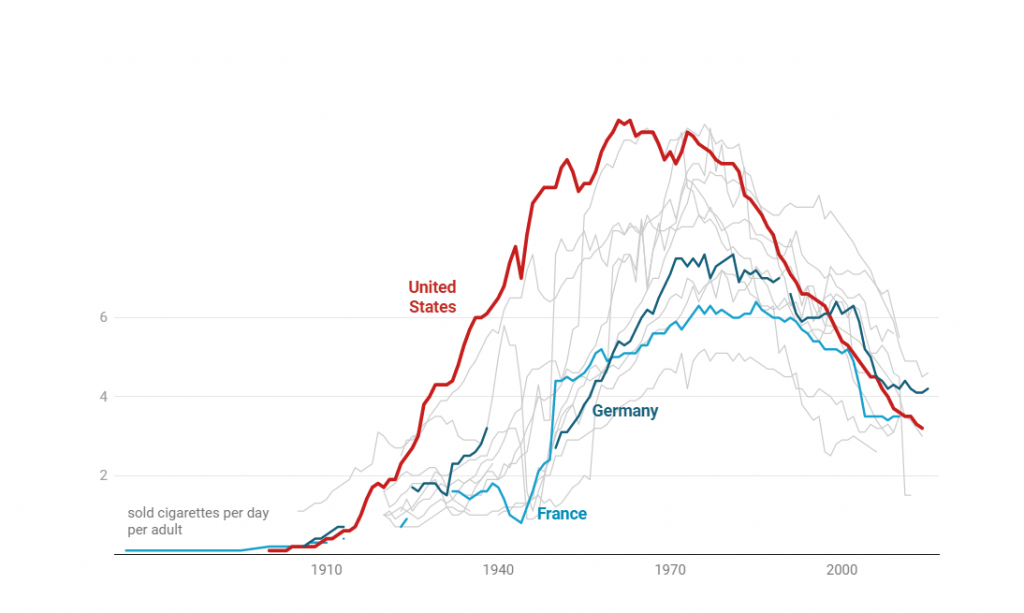
We pulled up data from multiple reports and statistics sites to find out the number of cigarettes sold per day per adult and used Datawraper to process that data. Here's what the final visualization looked like:
Editorial Note:
- Datwraper is more of a community project than a company selling a data visualization tool. Datawraper provides most of its functionality for free because they believe in delivering more value to its users and its community.
7. Visme
Visme is more than just a data visualization platform. It's a tool that integrates business intelligence with interactive design to help you create appealing data visualizations from multiple datasets that are easy to read and understand.
Pros:
- You can import data from any data source, even google sheets.
- This tool has multiple use cases
- Good customer support
- Easy-to-use Interface.
Cons:
- It can not handle complex datasets
- You can not download visualizations with the free version.
Data Visualization Example: Visme
Here’s a detailed step-by-step video explaining how Visme can help you with data visualization:
Editorial Note:
- As we mentioned earlier, Visme is more than just a data visualization tool; it's a whole design workshop on its own. Visme can be considered a modern and advanced version of Canva.
Top 4 Open-Source Data Visualization Tools
1. Plotly
One of the top open-source data visualization tools that deserve mention in this list. Plotly can be used to visualize datasets, and the final virtualization can be shared with readers on social media or any website.
Plotly offers integrations with programming languages like Matlab and Python, enabling complex visualizations. This open-source data visualization tool is widely used for collaborative work and disseminating, modifying, creating, and sharing interactive graphical data.
Plotly supports both on-premise installations as well as cloud deployment.
Pros:
- Easy sharing capability
- Works flawlessly for online collaboration
- Highly interactive user interface
Cons:
- The free version has many limitations
- Sometimes It becomes choppy and slow during data processing
2. Google Charts
The only tool on our data visualization tools list that doesn't need an Introduction is Google Charts. This free data visualization tool is extensively used for creating interactive charts for embedding online.
Google Charts works with dynamic data, and the final visualization can be exported in HTML5 and SVG format so that they can be added to any website without any additional plugins. Additionally, you can use any SQL databases like Google Spreadsheets, Google Fusion Tables, and Salesforce as a data source.
Pros:
- Free
- Easy integration
- Works well with dynamic data
Cons:
- No customer support beyond the tutorials and forums.
3. Redash
Redash is an open-source data visualization platform that can be self-hosted using Docker Compose or Kubernetes. It also supports over 20 different data sources and has the unique capability of supporting data joins across multiple data sources.
Pros:
- Powerful online SQL editor
- Can be self-hosted
- Drag & Drop functionality
Cons:
- Need DevOps engineers to configure this tool with your product database.
- The software sometimes becomes slow and takes time to load
Data Visualization using Redash:
Here's a tutorial that covers the step-by-step approach to visualizing data using Redash:
4. D3.JS
D3.js is a Javascript library that utilizes HTML, CSS, and SVG to render graphs and charts. This tool requires some basic JS knowledge, although there are many apps out there that allow non-programming users to utilize its library.
Pros:
- Free and open-source data visualization tool
- Highly customizable
- Offers a wide range of charts & graphs
- focuses on web standards
Cons:
- You need basic programming knowledge to use this tool effectively.
Example:
For this example, we plotted unemployment rates across the states for the year 2016 and displayed them using data maps: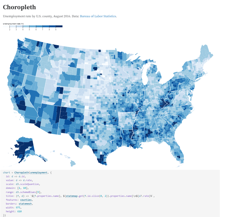
Choosing the right Data Visualization Tool
In today's era, where data is everywhere, brands need to be able to extract meaningful insights from available datasets. That's where having the best data visualization tools by your side help you out.
With such a huge variety of visualization tools available in the market, it becomes incredibly hard for designers, data scientists and marketers to decide which one to use.
When choosing the right data visualization tool for your business needs, you should consider the following factors:
- Ease of Implementation
- Learning Curve
- Cost
- Integration Capabilities
- open-source framework
Other than these factors, you should evaluate a data visualization tool for your business-specific use case. Because there isn't one size fits all concept in today's SaaS-driven economy.
FAQs:
Which data visualization tool is best?
Selective tools like Tableau, FusionCharts, Plotly, Qlikview, Google charts and D3.js can be classified as the best data visualization tools. These tools are considered best because they are easy to use, provide good customer support, are moderately priced and offer great integration capabilities.
What is the easiest data visualization tool to use?
Based on our experience using various data visualization tools, we would say Infogram is the easiest tool.
Which data visualization tool is best for Python?
Although many other options are available, like Matplotlib & Seaborn, we would say Plotly is one of the best tools for visualization that works well with Python.


Leave a Reply